
Et Voilà: The Moiré Effect
Illuseum Berlin
25. Sept. 2026
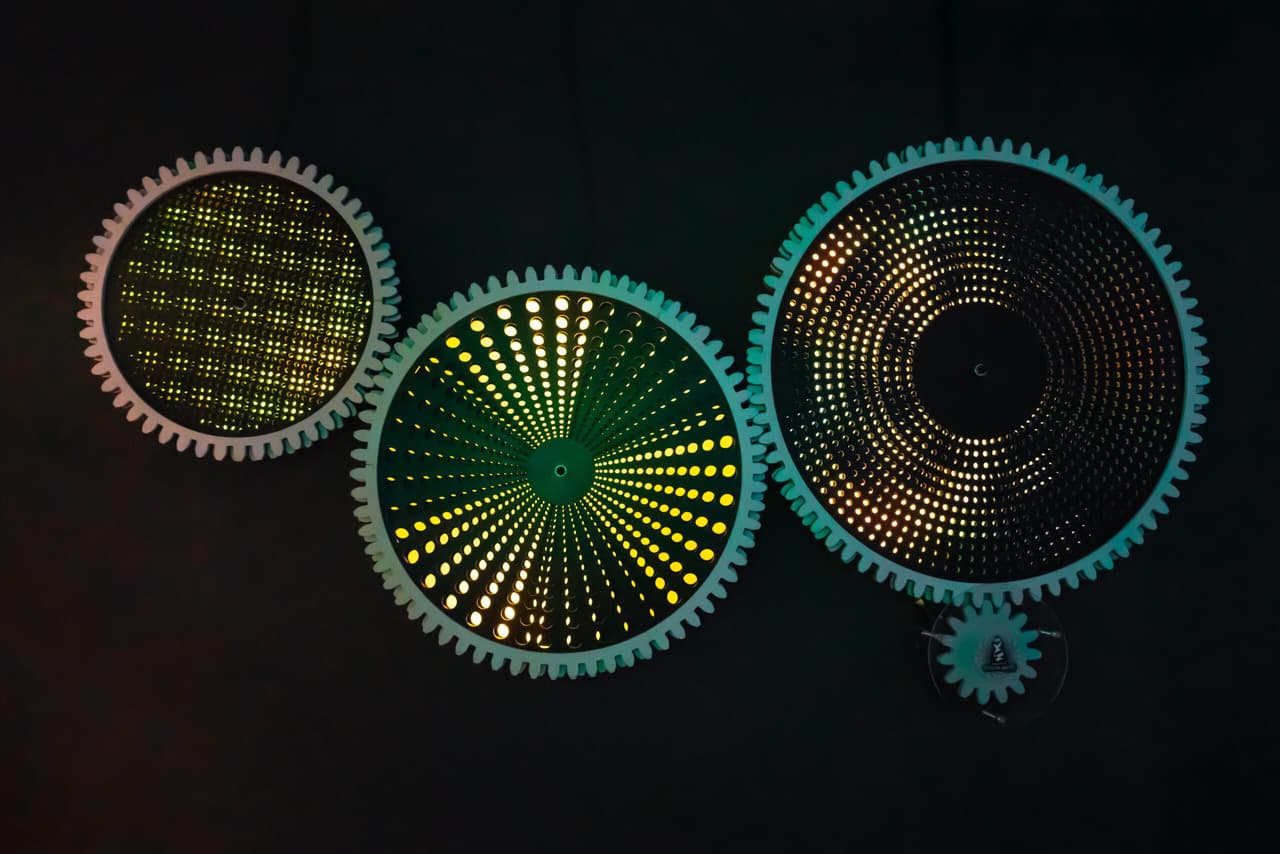
One Person’s Joy Is Another Person’s Frustration. A Fascinating Visual Phenomenon in Art and Architecture.
For artists, the Moiré pattern is a fascinating phenomenon that can easily manipulate our perception. The Moiré effect is used across different media, from painting to digital art, and in architecture it is not only a technical visual effect but also a source of inspiration for many designers.
How Does the Moiré Effect Work – and Why Do Artists Love It, Photographers Avoid It and Fashion Designers Embrace It?
Simply put: Moiré occurs when two regular patterns overlap.
Our eyes do not cope particularly well when two layers of regular patterns are placed slightly offset on top of one another. This creates an optical illusion that can make an image appear to move, shimmer or become blurred.
The word Moiré comes from the French term “moirer”, meaning something like “to marble”. So the effect has nothing to do with dying – French mourir – even though photographers, filmmakers and television crews may sometimes wish this unwanted visual effect would simply disappear.
In the digital world, Moiré can occur when regular patterns are finer than the resolution a camera sensor or screen can accurately reproduce. Perhaps you have noticed it yourself? Whether it is a presenter wearing a fine pinstripe blouse or an actor in a stylish checked jacket, certain types of clothing can cause serious headaches for camera operators and image technicians. Fine stripes and tiny checks can be difficult for cameras to reproduce correctly and are therefore often an absolute no-go in front of the lens.
So what can you do about it? In photography and video, using a sufficiently high resolution can help reduce the risk of Moiré. And in the worst case, image-editing software such as Photoshop can help correct the effect afterwards.
In the analogue world, however, the artistic effect can quite literally make your eyes spin. Especially in fashion, there are almost no limits to creativity: different fabrics, bold colours and sophisticated patterns create endless possibilities. There is no absolute right or wrong – and tastes are different, after all.
Moiré has long been used as a decorative pattern and remains a favourite among major fashion houses and designers. Whether on a cocktail dress, jacket, accessories or interior decoration, the effect can add a distinctive visual character – entirely according to personal taste.
The Moiré Effect in Architecture: How Can Buildings Visually Trick Us?
Believe it or not, the Moiré effect can also appear in architecture, where the interaction between light and shadow, structure and perspective plays a central role.
Louis Vuitton does not limit striking patterns and visual effects to its fashion collections. The Fondation Louis Vuitton in Paris is a private museum primarily dedicated to modern and contemporary art. Its architecture demonstrates how overlapping structures, curved glass surfaces, reflections and changing perspectives can constantly transform our perception of a building as light and shadow interact.
Barcelona’s Torre Glòries also features a curved, reflective façade that changes depending on viewing angle and lighting conditions. Its layered surfaces and changing reflections create dynamic visual effects that continuously alter the appearance of the building.
Artists Who Explore Moiré and Related Optical Effects
M. C. Escher (1898–1972)
One of our favourites is M. C. Escher, and you can admire some of his original artworks here at Illuseum Berlin. He is famous for his mathematically inspired graphics and his manipulation of space and perspective. His use of repeating structures and complex arrangements challenges the boundaries between illusion and reality and can give viewers the feeling of entering another dimension.
Victor Vasarely (1906–1997)
Victor Vasarely is considered one of the pioneers of Op Art, a movement centred around optical illusions and visual phenomena. In many of his works, including “Zebra” and the “Vega” series, he uses geometric structures, contrasting forms and optical effects to create a sense of movement and depth. The interaction of colours and shapes plays with the viewer’s perception and creates powerful visual dynamics.
Bridget Riley (born 1931)
British artist Bridget Riley is known for her geometric patterns and powerful optical effects. Works such as “Cataract 3” (1967) demonstrate how repeated lines, patterns and subtle variations in colour and form can create visual tension, movement and an intensified viewing experience.
Wolfgang Laib (born 1950)
Contemporary artist and sculptor Wolfgang Laib is known for installations and objects that explore the relationship between natural materials, space and light. His minimalist works demonstrate how simple forms and carefully selected materials can fundamentally change the way we perceive a space.
Our Conclusion: Moiré est super génial
The Moiré effect is a phenomenon that we find both fascinating and challenging. Whether used as an aesthetic element in art or encountered as an unwanted technical problem, understanding how it works can make all the difference. For artists, designers and architects, it can become a powerful tool for exploring space, movement and perception.
From classic approaches in Op Art to contemporary architecture, the Moiré effect demonstrates the endless possibilities created by overlapping patterns and structures. By experimenting with this phenomenon, artists and architects invite us to rediscover the relationship between our eyes and the space around us. Moiré remains a fascinating example of the power of visual art and design.
If you would like to experience the Moiré effect for yourself, here is a simple guide to creating your own artwork using Moiré patterns.
Moiré – Do It Yourself!
You do not need a ready-made template like the ones we use at the museum to create your own Moiré pattern.
You will need:
2 sheets of tracing paper or alternatively thin translucent paper (A5)
Permanent markers in 2 colours
A ruler
Optional: graph paper
Here’s how it works:
Place one sheet of tracing paper on top of the graph paper and use your ruler to draw lines in one colour approximately half a centimetre apart. If you do not have graph paper, you can simply estimate the spacing. Then repeat the process with the second sheet of tracing paper using a different colour.
Once both sheets are covered with lines, place them on top of each other with one sheet slightly offset. And there you have it – your own optical illusion!
The lines appear to distort where the two patterns overlap. Have fun experimenting!